Personal Project
GroceryPal
Overview
GroceryPal is a mobile app that helps individual shoppers track their grocery buys by expiry date, so they waste less food. I regularly forgot what groceries I already had, overbought items, and discovered expired food too late — existing pantry apps either created too much administrative work or hid key features behind subscriptions. I wanted to build an app I could actually use myself.
My Contribution
Sole Product Designer, working with Claude Code as an implementation partner
Collaborators
Solo project
Date
Early–mid July 2026 (~1 week, scoped as MVP)
Opportunity
I looked at existing grocery management apps — KitchenPal, Pantry Pal, Stock Pal — and found they didn't meet my needs. Some had UIs that weren't clean or minimal and required a learning curve; some lacked AI receipt-scanning or gated it behind a paywall. Having done preliminary research into this problem space at a Build For Good hackathon in 2024, I knew it was a rich problem worth designing for properly, and wanted to ship an MVP quickly — which is where Claude Code came in.
Project goals: ship a working, interactive MVP; explore an AI-assisted design-and-implementation workflow.
User goals: add or remove items with minimal friction; make the administrative work of managing food inventory enjoyable; make calm, informed decisions about groceries.
Research Insights
Drawing on prior research with 25 participants from a previous iteration of a grocery app (KiasuKitchen), three findings shaped this project:
- Manual logging/editing is the top friction point and adoption risk. Participants found scanning receipts and updating the app constantly tiring.
- Users don't know or want to type exact expiry dates. They're unsure of exact dates and want the app to auto-populate them.
- Cooked food and leftovers are a bigger waste source than groceries for several households.
Design Principles
Three principles guided the design: minimize friction for stock upload or deletion (the single biggest reason users would abandon the app), maximize visibility into current stock (not seeing what was bought is a major cause of forgetting and wasting it), and maximize joy (a tedious task done well can still feel satisfying).
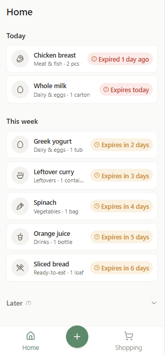
Visual direction: muted, calm tones with pops of colour at key moments, to feel organised and enjoyable rather than anxiety-inducing. Green as the primary brand colour signals the freshness regular stock management delivers. WCAG 2 contrast throughout keeps the interface accessible as well as clean.
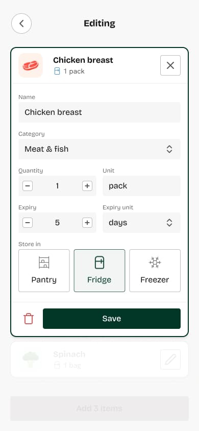
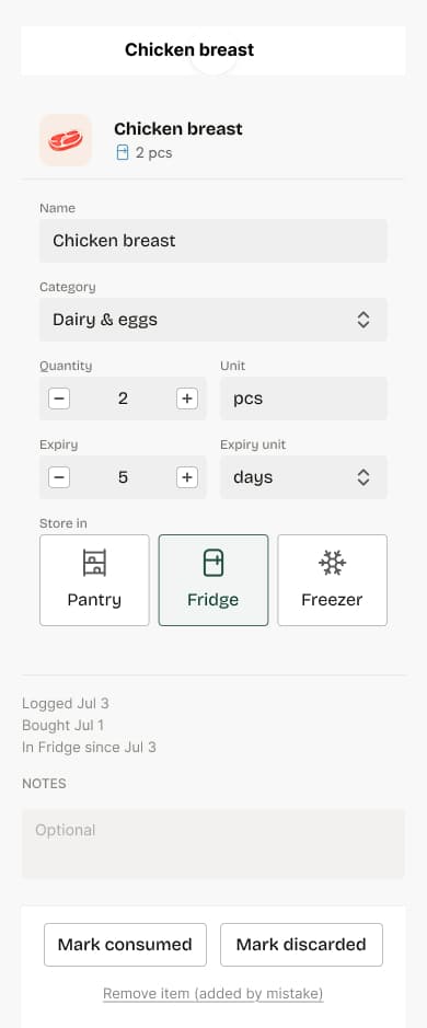
Motion: calm, purposeful, and mostly invisible. An editable card that expands in place and scrolls to the top of the screen, for example, anchors users in their current flow without losing context of where they were in their list.
AI-Assisted Design Workflow
Rapid Concept Generation
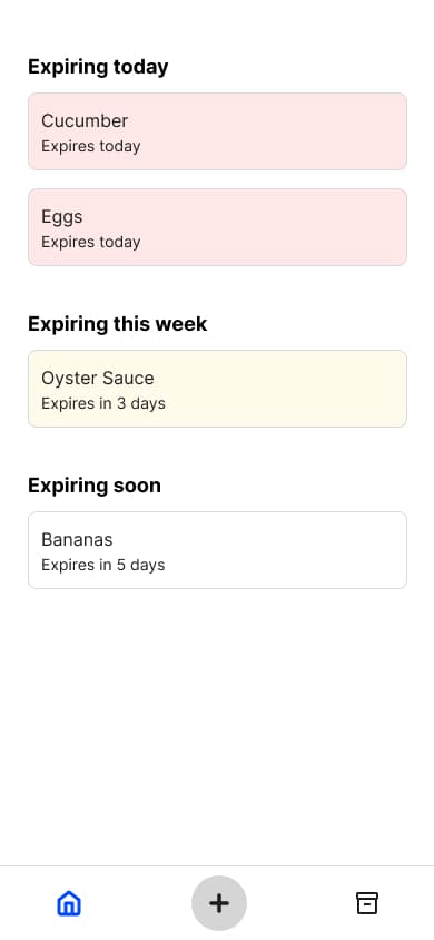
I used Claude to produce first-draft designs for the flows I wanted to tackle first — the home screen and adding-items flow — which gave me a working prototype to interact with on my device almost immediately and start thinking concretely about the interactions. Once a flow was validated in code, I moved back into Figma to refine colour, spacing, and hierarchy; matching design tokens between Figma and code wasn't a priority at this stage.
Interaction Refinement
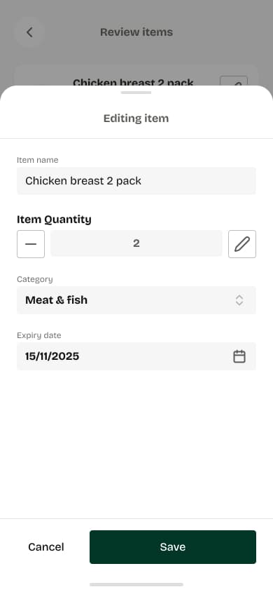
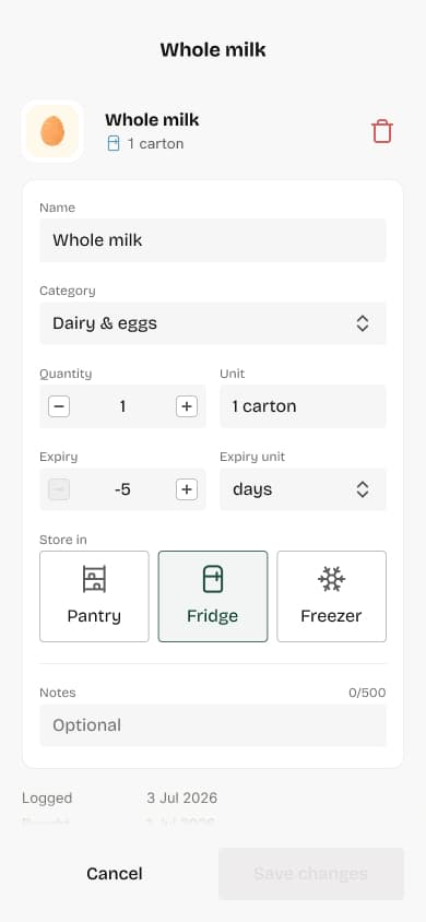
Working with AI-built prototypes let me feel out the editing flow directly. I decided to switch from a bottom sheet to an in-place editing card, so users stay in context of how far along their item list they are, and refined the motion until it felt smooth and tactile.
Visual Polish
Once the flow was refined, I asked Claude Code for three visual-direction variations and weighed the trade-offs of each before returning to Figma to finalize the visual identity.
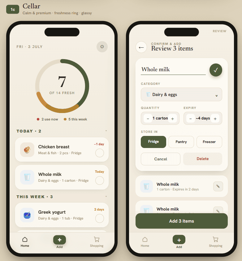
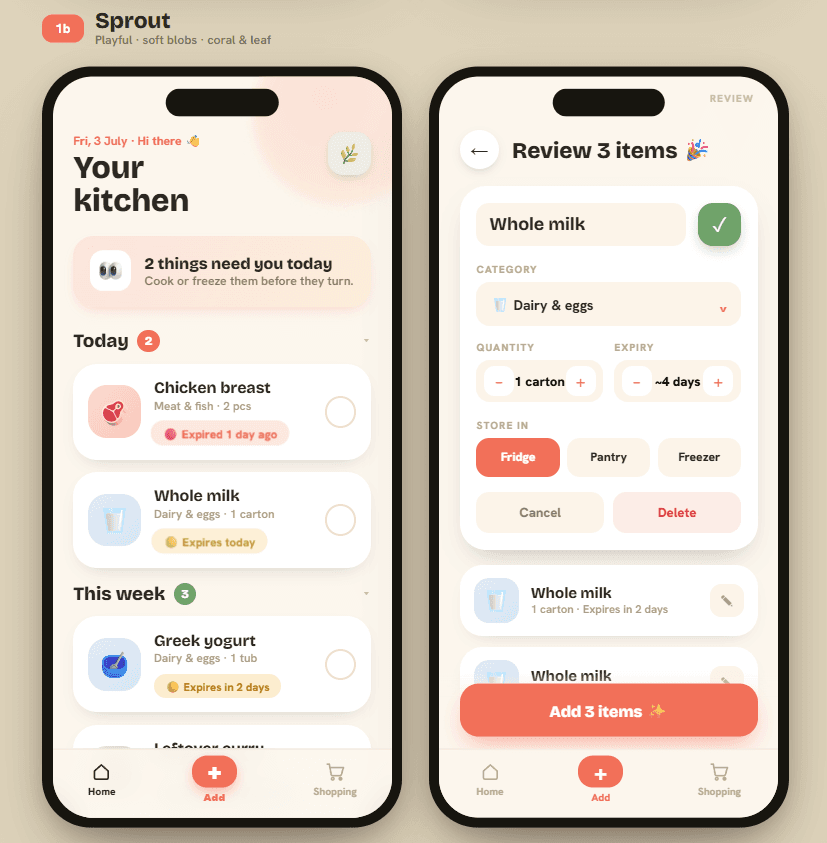
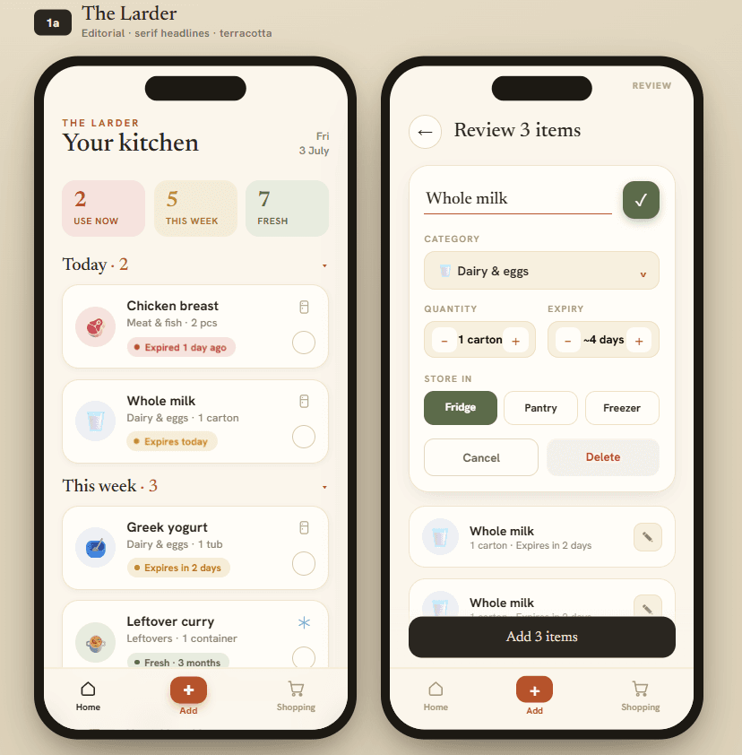
I liked the calm colour tones in the first direction, but didn't find its pie chart particularly helpful for understanding inventory at a glance. The second direction's playful typography gave the app a fresh feel. The third's more restrained palette ultimately informed the final design.
Development Implementation
Claude Code produced reasonably well-matched designs, though I still had to fix small bugs one by one and check that design updates propagated consistently throughout the app. Around this point I started building out design.md, adding rules to the document as I iterated with Claude Code — once it was in place, generated designs landed much closer to intent, though still needed adjustment.
Challenges
Product challenges: balancing how much to highlight elements with brighter colours or chips was a recurring tension — too much felt cluttered, too little defeated the point. I removed expiry-notification chips from every card and reserved them for items needing immediate attention only. I also had to decide how much control to give users over AI-generated values (item name, category, quantity, expiry date). A date picker would have allowed an exact expiry date, but research and personal experience both suggested people rarely know one — so I used a stepper for both expiry dates and quantities instead.
AI workflow challenges: I had to learn better prompting techniques to manage tokens — choosing the right model, starting new sessions for new tasks, and compacting sessions. Wanting to get Claude Code to generate designs consistent with my existing work is what led me to learn about design.md and how to structure it properly.
Final Product
GroceryPal is a working MVP deployed on Vercel, connected to the Claude API, able to scan receipts and log them into a grocery management system — designed and shipped in one week. Current features include receipt scanning, AI categorisation, expiry tracking, editing, and inventory management, with a backlog of further features awaiting development.
Reflections
As a product designer: working directly in code with AI changed how I evaluate my own decisions. The trade-off between build complexity and "nice to have" features became tangible because I had to manage its cost directly — which made me more honest about which ideas were actually worth the complexity, and more focused on refining the parts of the app that mattered most.
Working with AI tools: incorporating AI at specific points in my design flow — exploring initial directions quickly, drafting a first pass of a screen or flow for further refinement, and prototyping — is a fast way past the blank canvas and into iteration, letting designers take over once the shape of an idea is ready to be refined into something dev-ready.